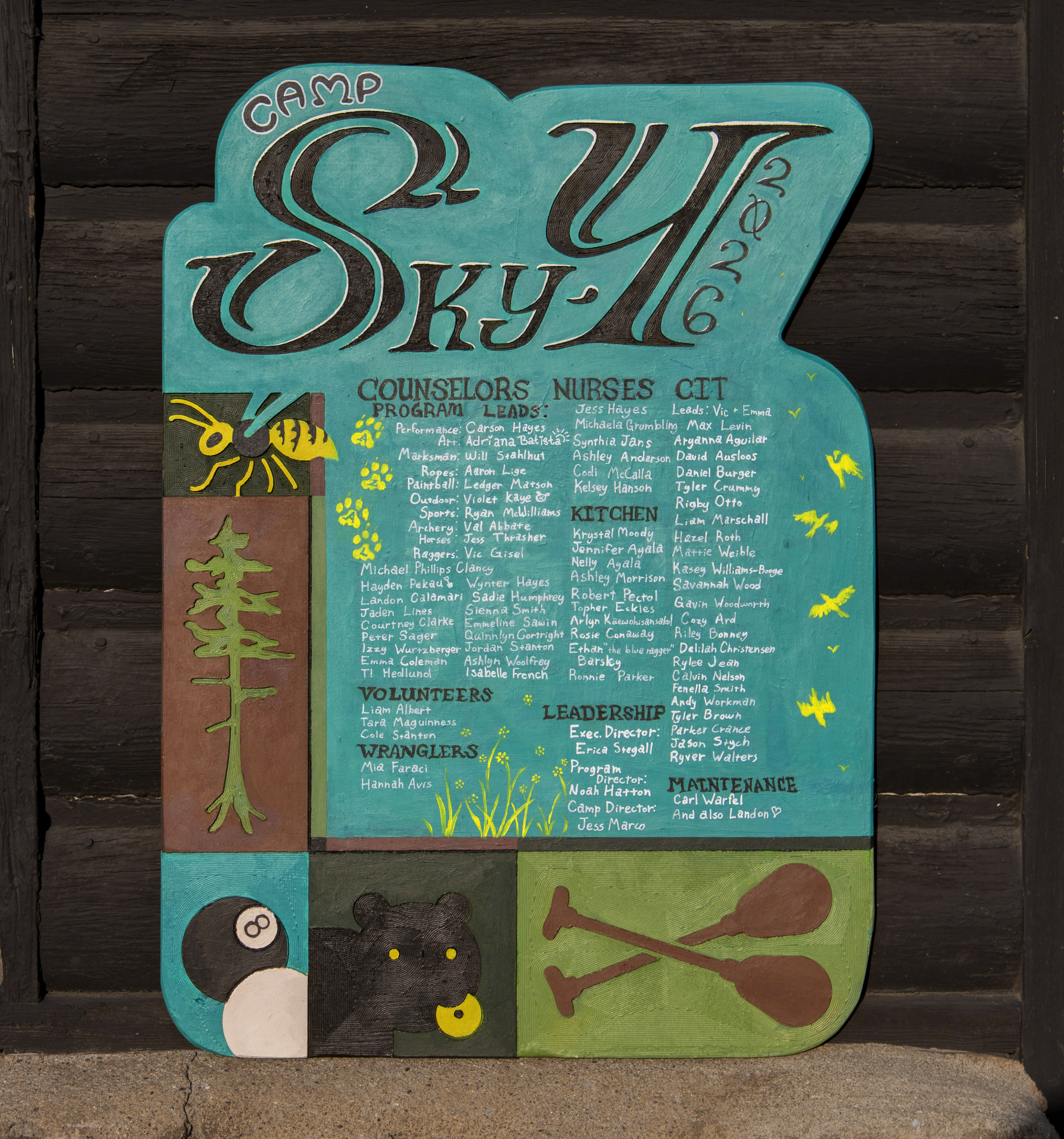
I have worked for YMCA Camp Sky-Y for several years and this summer, my last summer, I finally got to make our commemorative staff plaque, a long-time personal dream.
I sought to make a beautiful plaque that represents everything special about this summer while creating a unique aesthetic, inspired by vintage Sky-Y signs with a modern twist that combines analog and digital processes.
Process
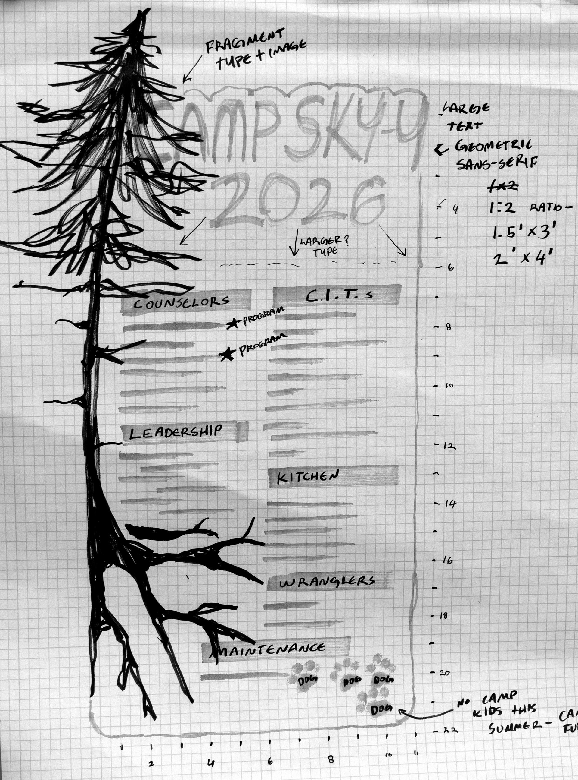
Step 1: Ideation
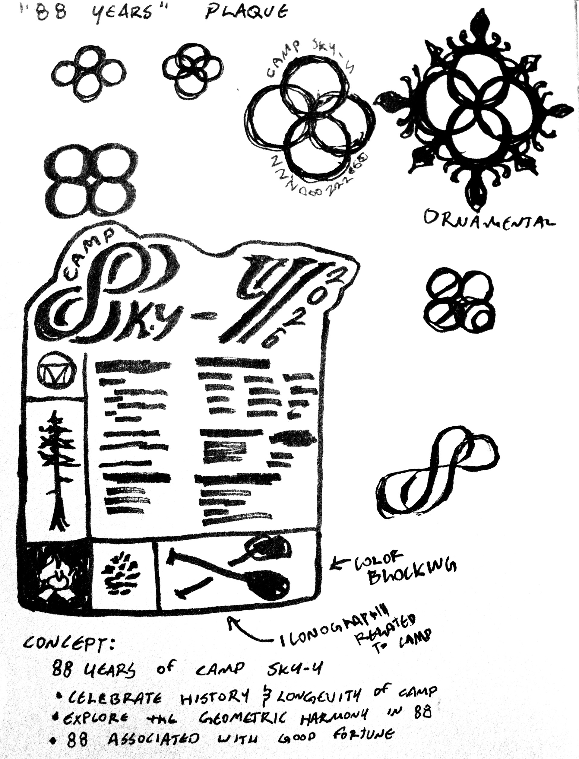
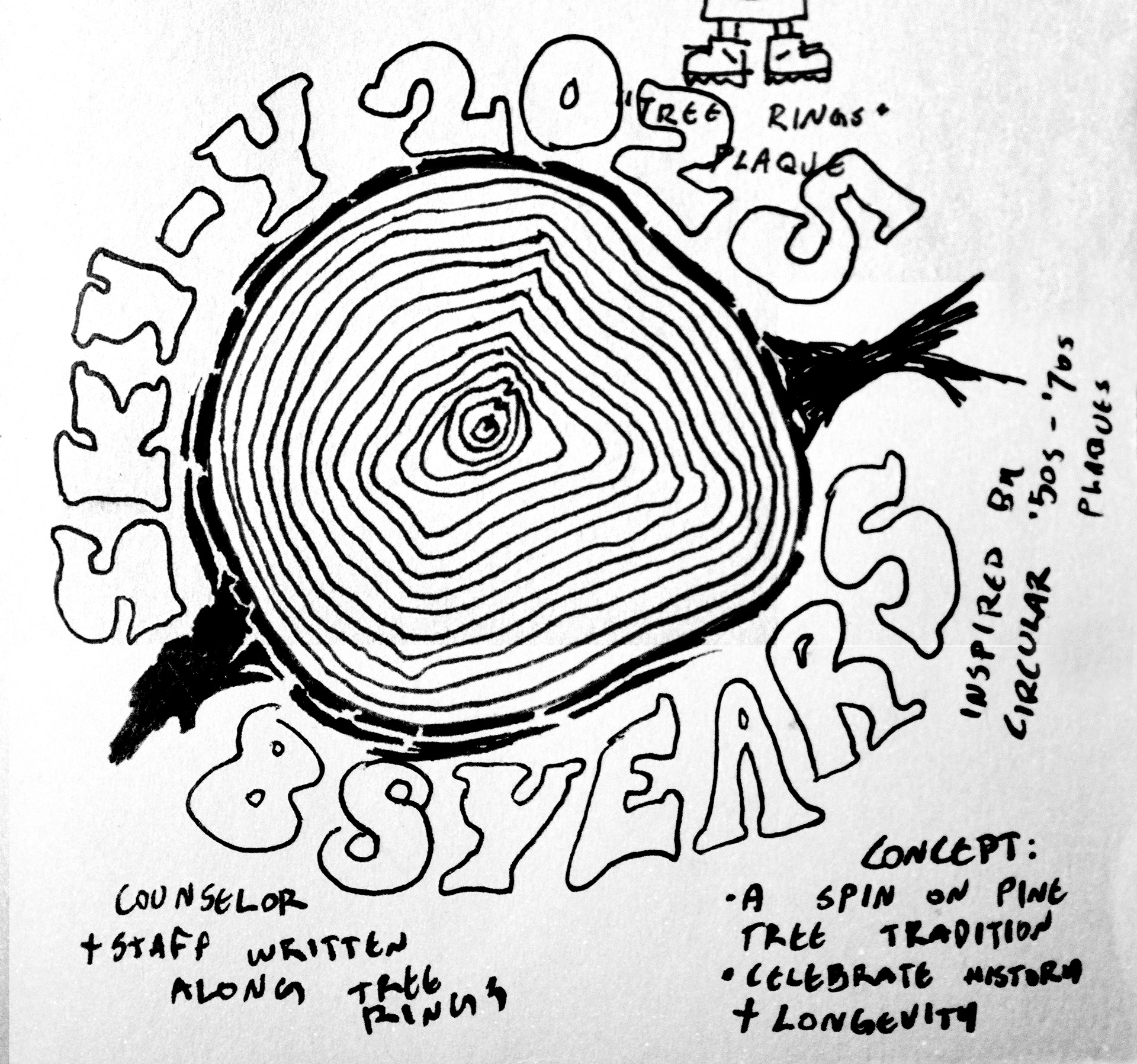
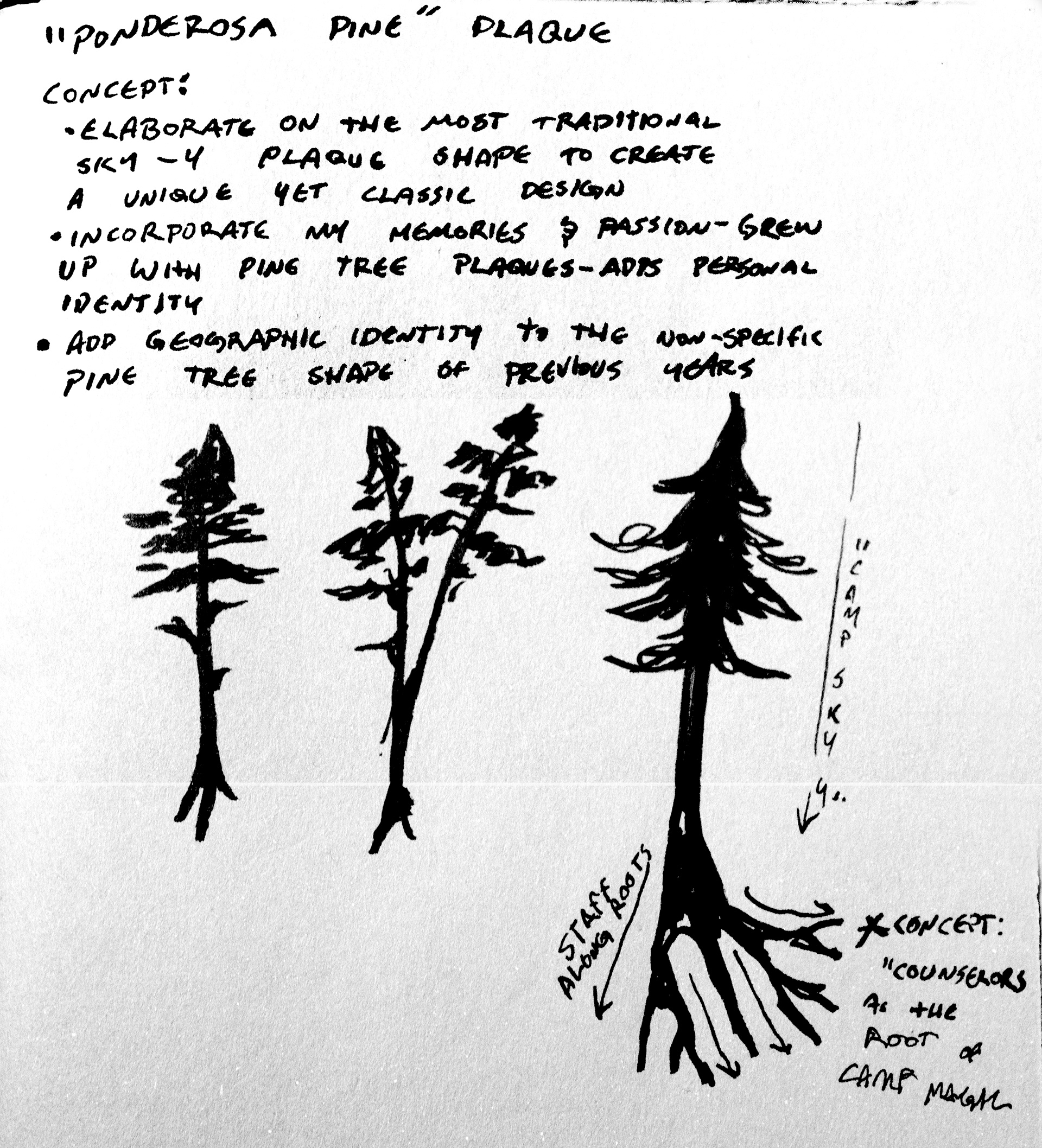
I came up with and sketched out several ideas for the plaque which I presented to Adriana, the art program lead at Sky-Y and my creative director for this project.
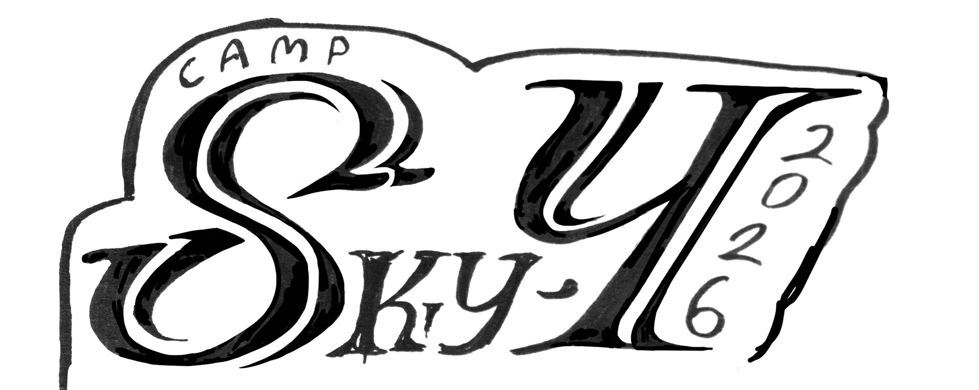
Hand-drawn lettering sketch to be traced into vectors.
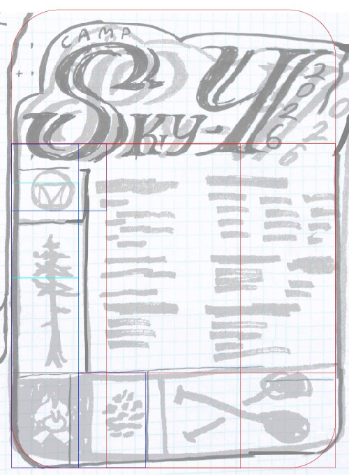
Photo-bashed sketch with proportional guides set up.
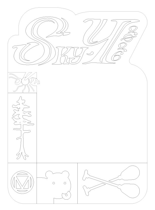
Clean vectors ready to be translated to CNC instructions
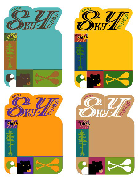
Just a few examples of different colorways I tried
Step 2: Refinement
Cleaning up the sketch, setting design elements on a harmonic proportional grid, creating clean vector lines for CNC carving, and establishing a color design.
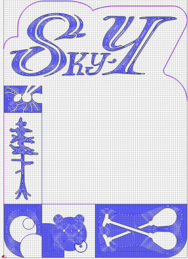
Setting toolpaths along my vector design.
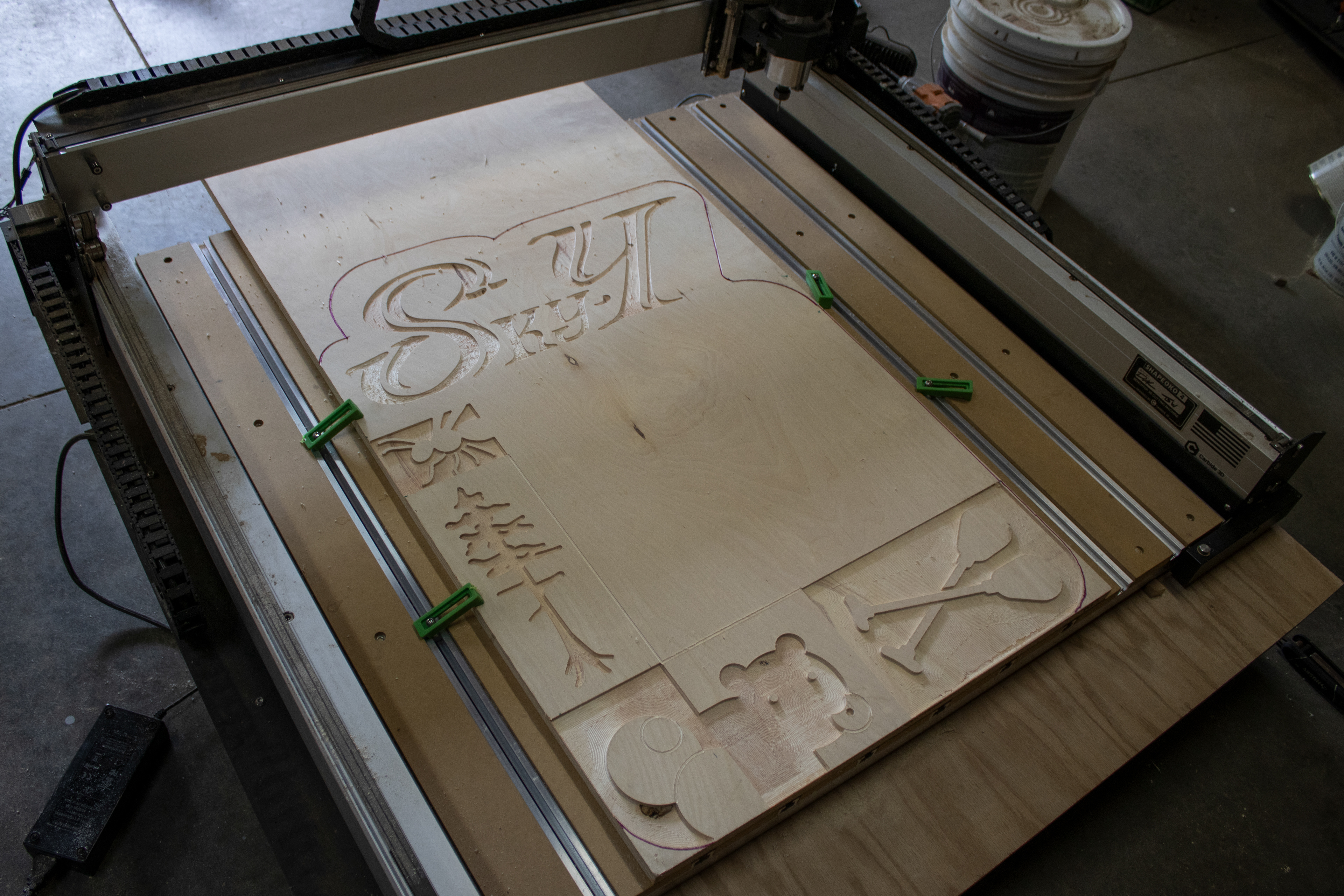
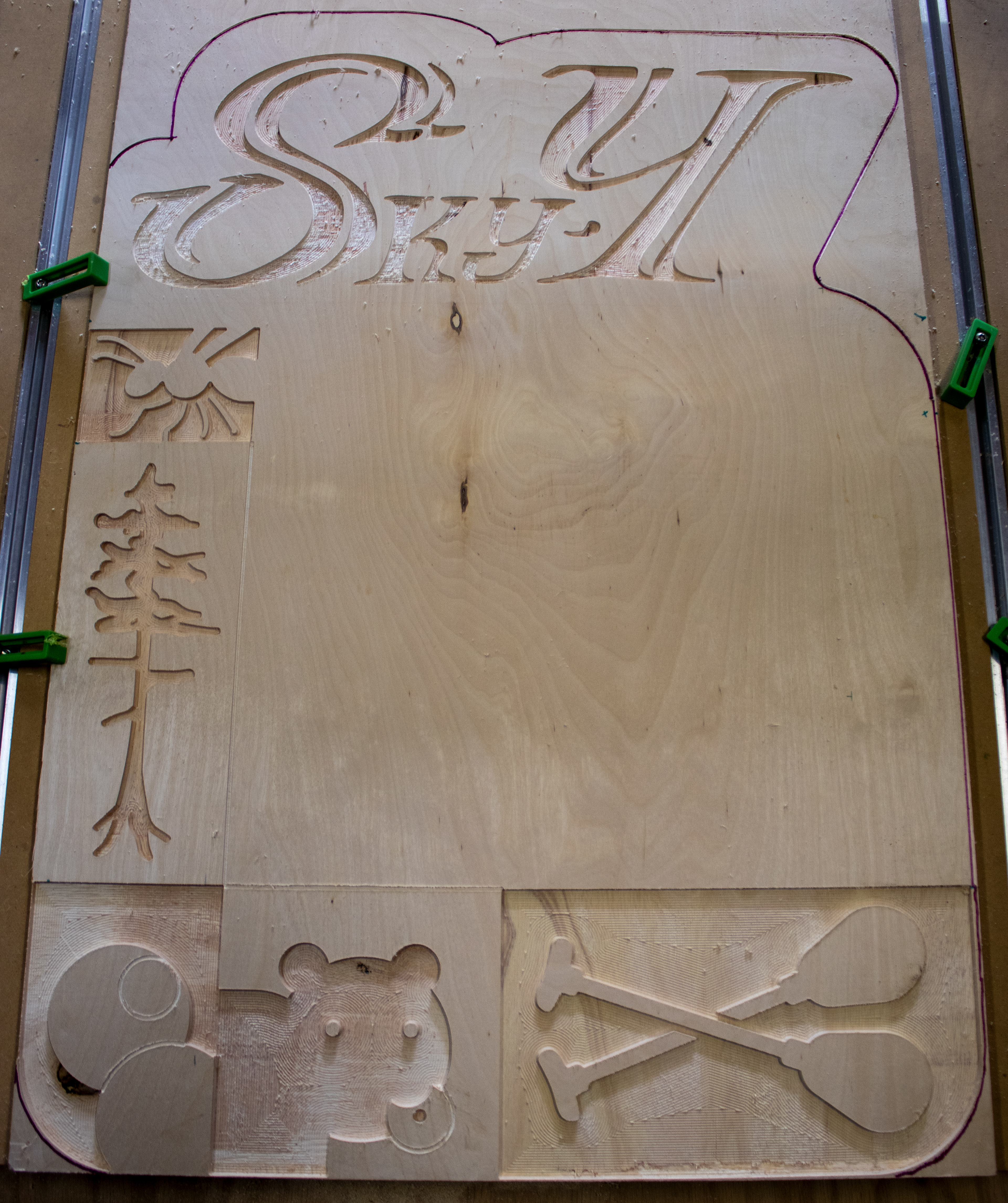
Step 3: CNC Machining
I wanted to introduce a 3D element while maintaining the utmost geometric precision of my design, which made this a great project to use our CNC machine on. The catch? It hadn't been used in over two years and nobody on our staff knew how to use it. On my own, I taught myself how to design for and operate our machinery, and though there was trial and error, it came out perfect!
Step 4: Typesetting and painting
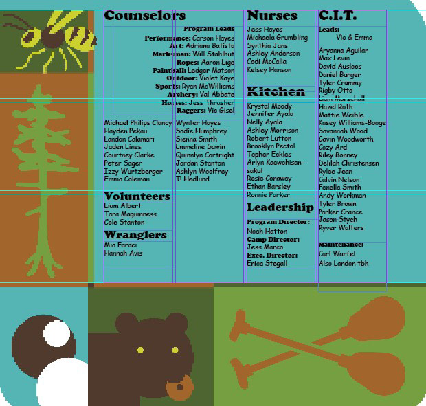
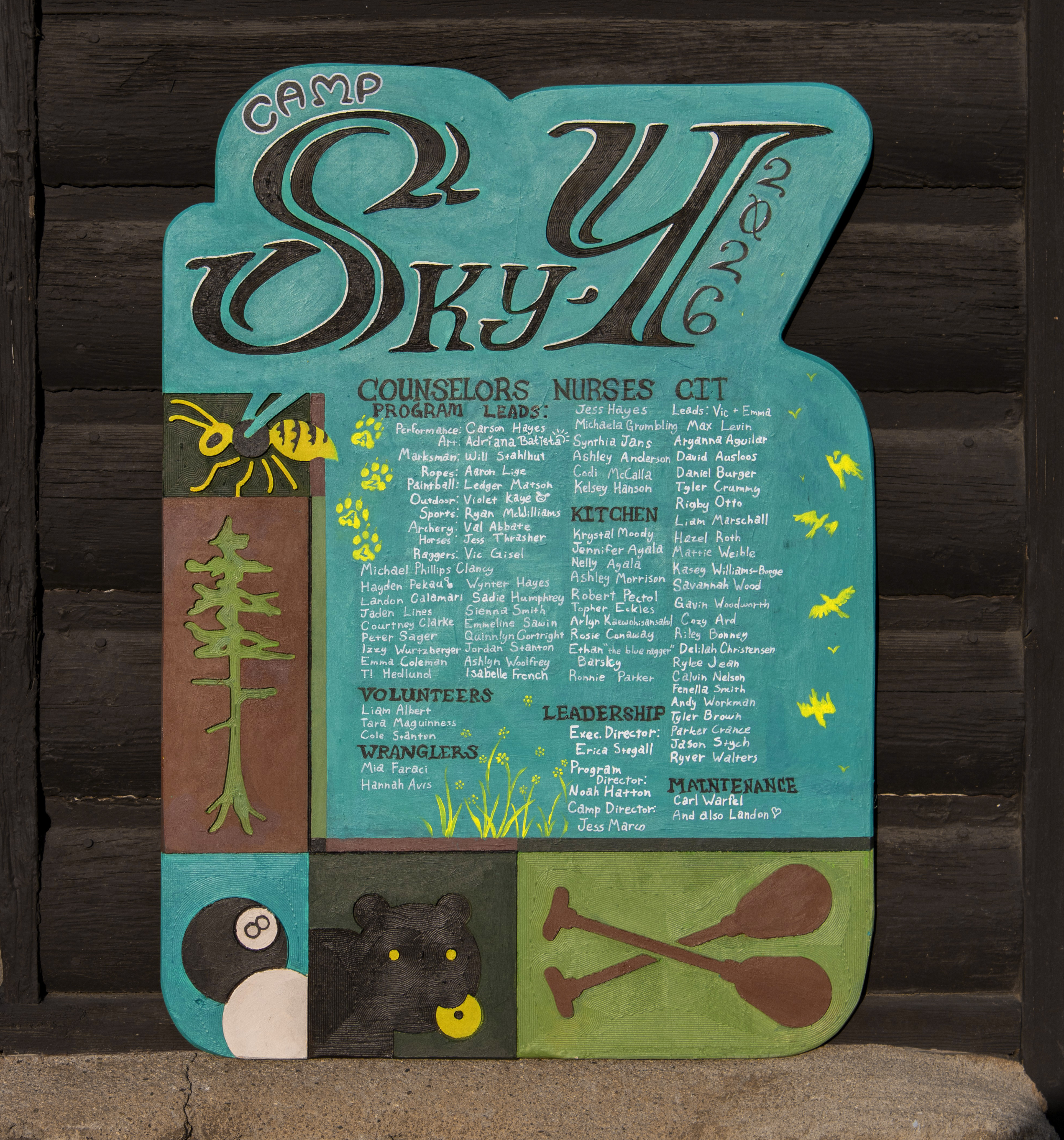
After the machining was complete, we sanded down the plaque and started painting. I brought the design into InDesign to set the type on a grid. I used display and script typefaces to ensure that everything would be legible at scale once we hand-painted all of the lettering.
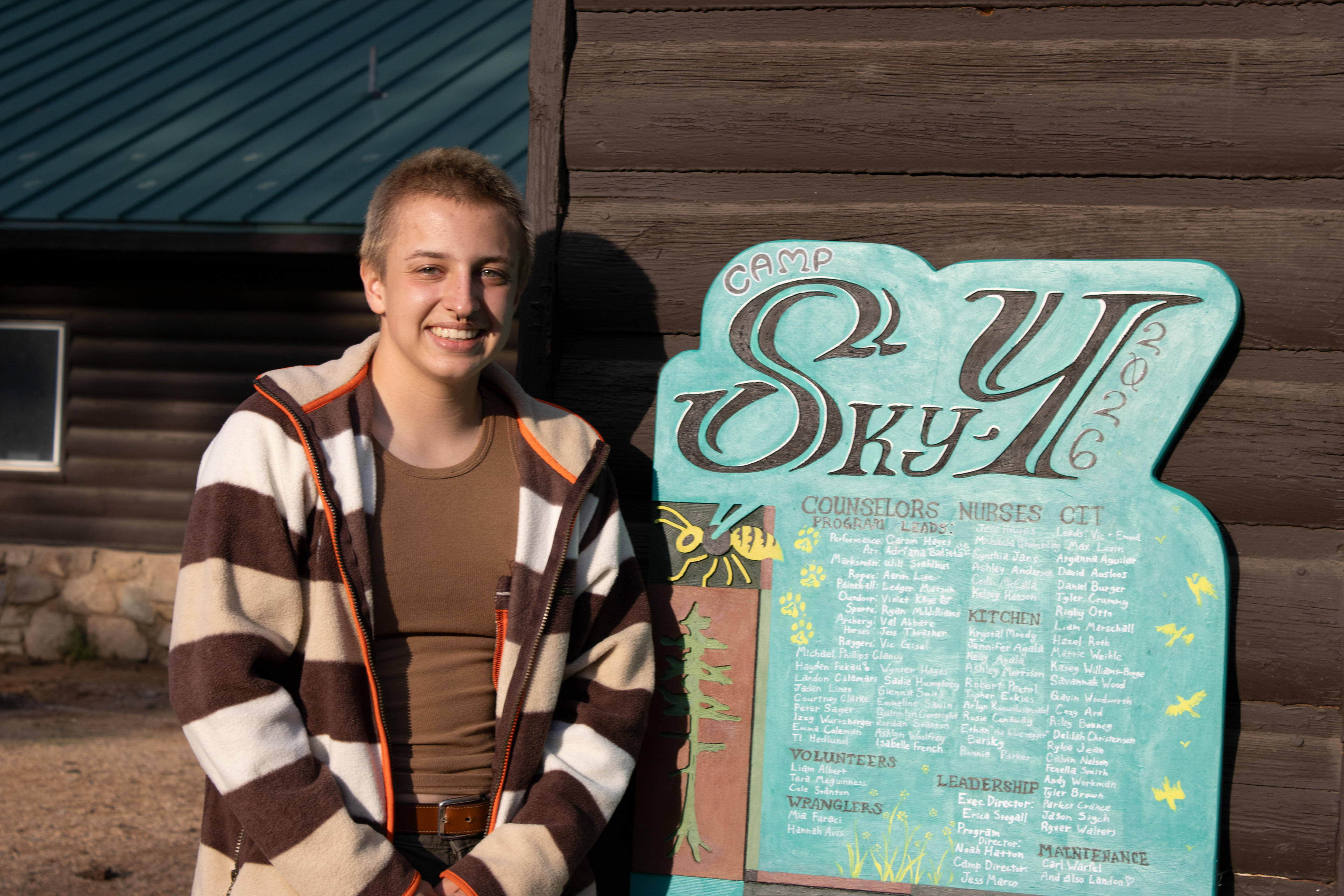
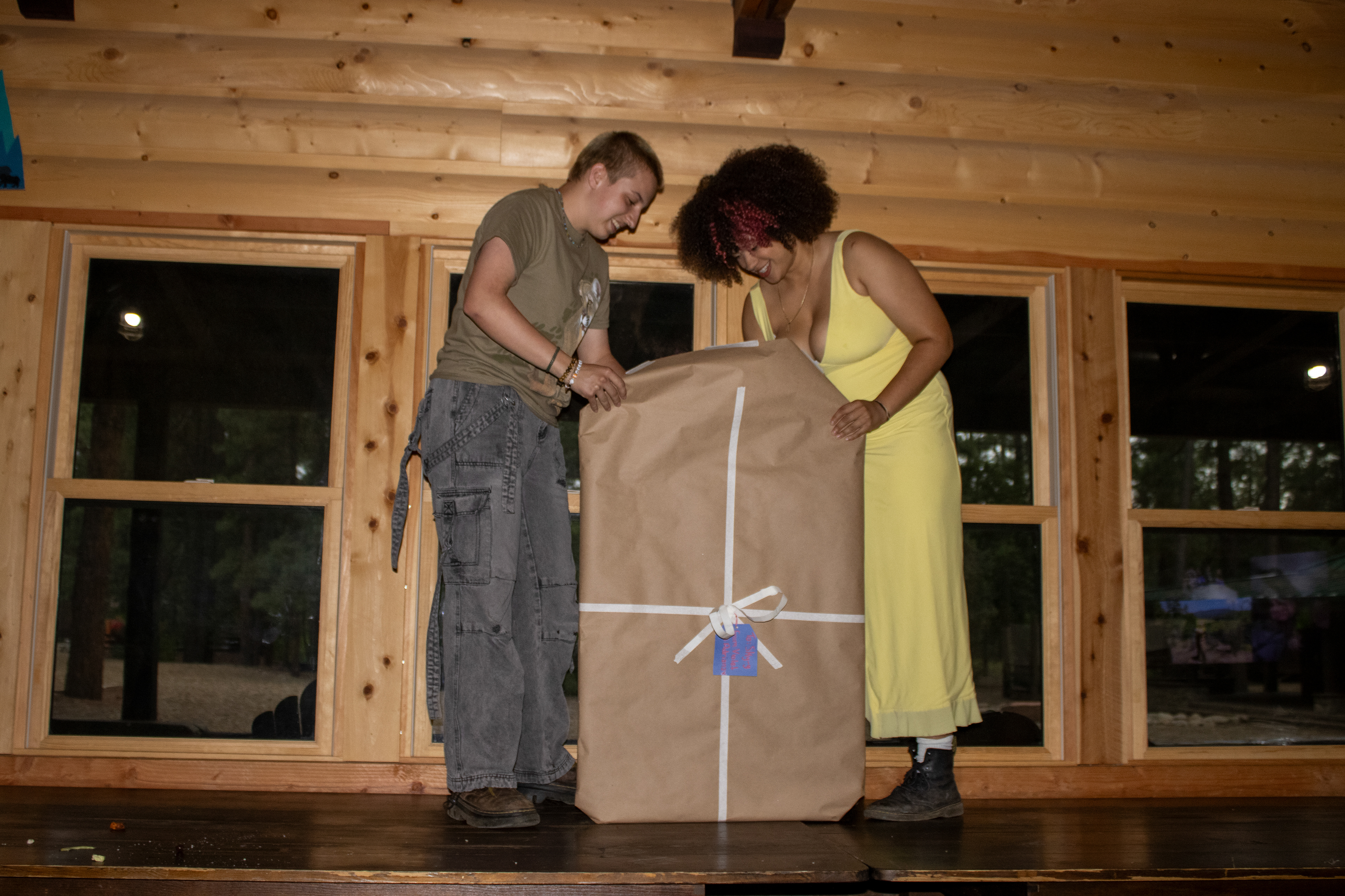
Ready to unveil my final gift to Sky-Y
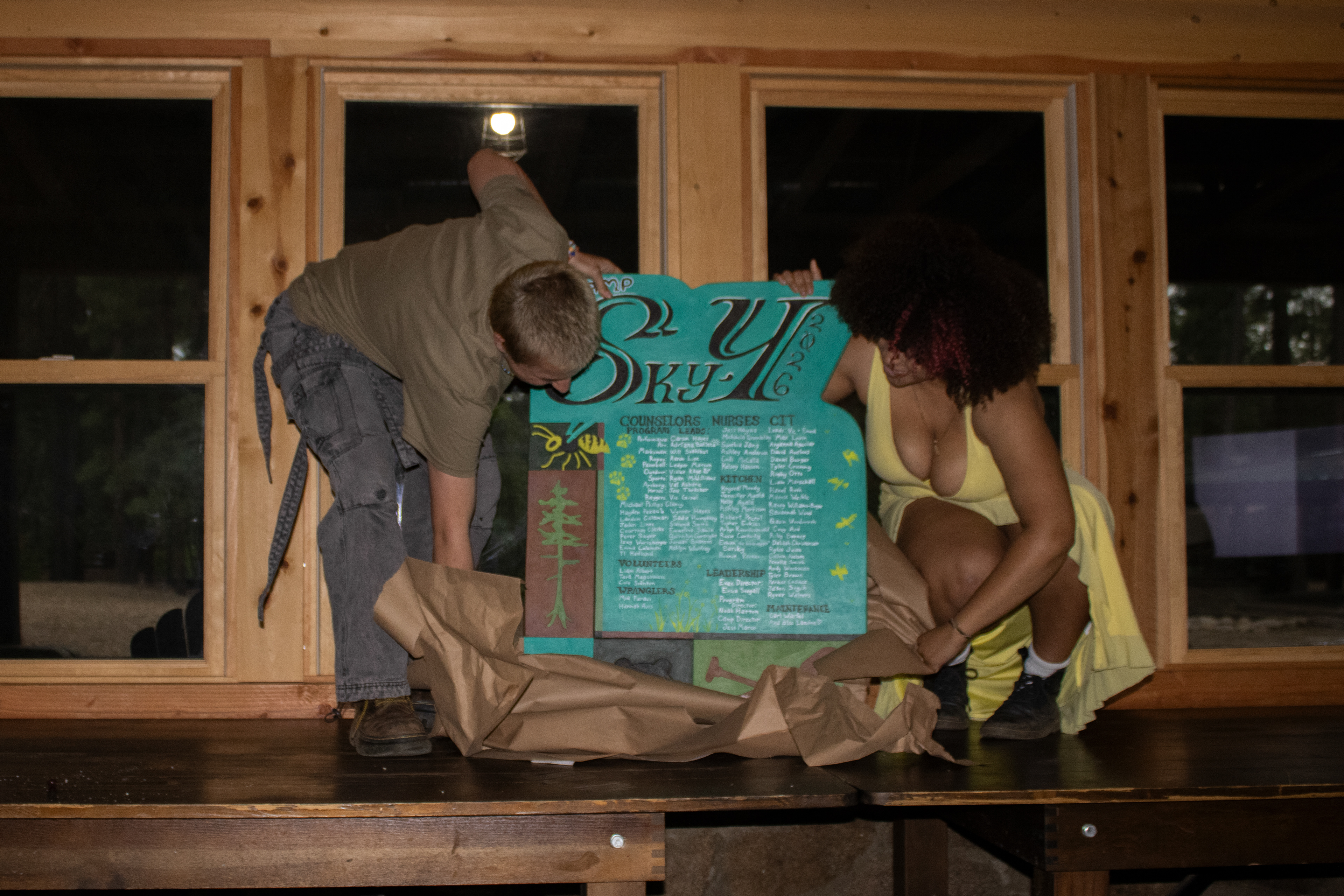
Ta-dah!
Statement and inspirations
This project was incredibly special to me. Every summer since Camp Sky-Y was founded in 1938, a commemorative plaque has been handcrafted by a member of staff. I longed to create one since I first arrived as a camper at 9 years old.
A bit of information on the illustrations adorning the plaque:
The yellow jacket sits at the top of the composition since they seemed to want all eyes on them at all times this summer. For the past 10 years we never had a stinging insect problem, but for 2026 they decided to torment us!
The ponderosa pine is one of the most distinct features of the beautiful Prescott National Forest where Camp Sky-Y resides. Pine trees are a traditional motif within Sky-Y plaques, with a great number of plaques being cut into the shape of a pine tree. It's the classic design I associate with the plaques that were made during my childhood, so I knew had to put my own spin on it in my plaque.
The pool balls represent the simple fact that 2026 was the summer of pool. Though we've had a pool table for years, it was never really used ... until I started taking my kids to play pool on rainy days and it caught on, becoming one of the go-to activities for older kids this season.
The bear is our friend at Camp Sky-Y, Yogi, who would come and rummage through our dumpsters nearly every night. There's an iconic security camera photograph of Yogi emerging with a single donut hanging out of his mouth.
The oars, a bit self-indulgently, represent one of my favorite camp activities: boating! This summer Camp Sky-Y massively improved its aquatic programming by creating a contract with Lynx Lake, a much larger lake than we previously used which allows boating and swimming. So we got out kids in the water as much as possible!
The paw prints represent each of the camp dogs this season. Traditionally "camp kids," the children of the camp director at the time, would be included on the plaque. But our new director has fur-babies!
The woman to the right of me in the final 2 pictures is Adriana Batista, who was my creative director for this project and who helped with the final painting stage.
After giving everything to Camp Sky-Y for so many years, I was more than pleased to offer this project as my final gift.